


2025 NWSL Kit Release Reactions
Your NWSL This Week hosts pick their winners and losers from the kit launch


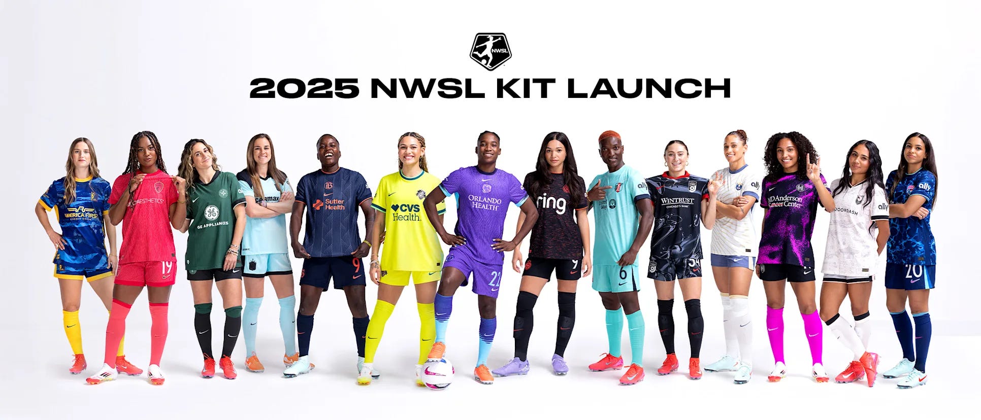
The new National Women’s Soccer League season is barely two weeks away and that can only mean it’s time for the 2025 kit launch.
Last year saw the first of the new, expanded Nike contract that brought unprecedented color and boldness to the league after the relaxation of strict rules around what constitutes light and dark kits. Flashy new primary kits were launched in 2024 alongside cookie cutter secondaries that all featured a solid color in an identical gradient pattern. While last year’s designs will remain the primary kits for 2025, those gradients have been tossed for each team’s unique take on their secondaries.
Bold change never fails to bring about strong opinions and your hosts from the NWSL This Week podcast, Bekki Morgan and Michael Minnich, certainly have some strong opinions about the new 2025 offerings. Instead of ranking each kit, we’ve grouped our kits below into winners and losers. We also have a ‘divisive’ category for those we just couldn’t agree on.
Let’s start with the worst of the bunch.
Note: The “what they say” text below is adapted and/or quoted from each team’s press release.
Losers
Gotham FC
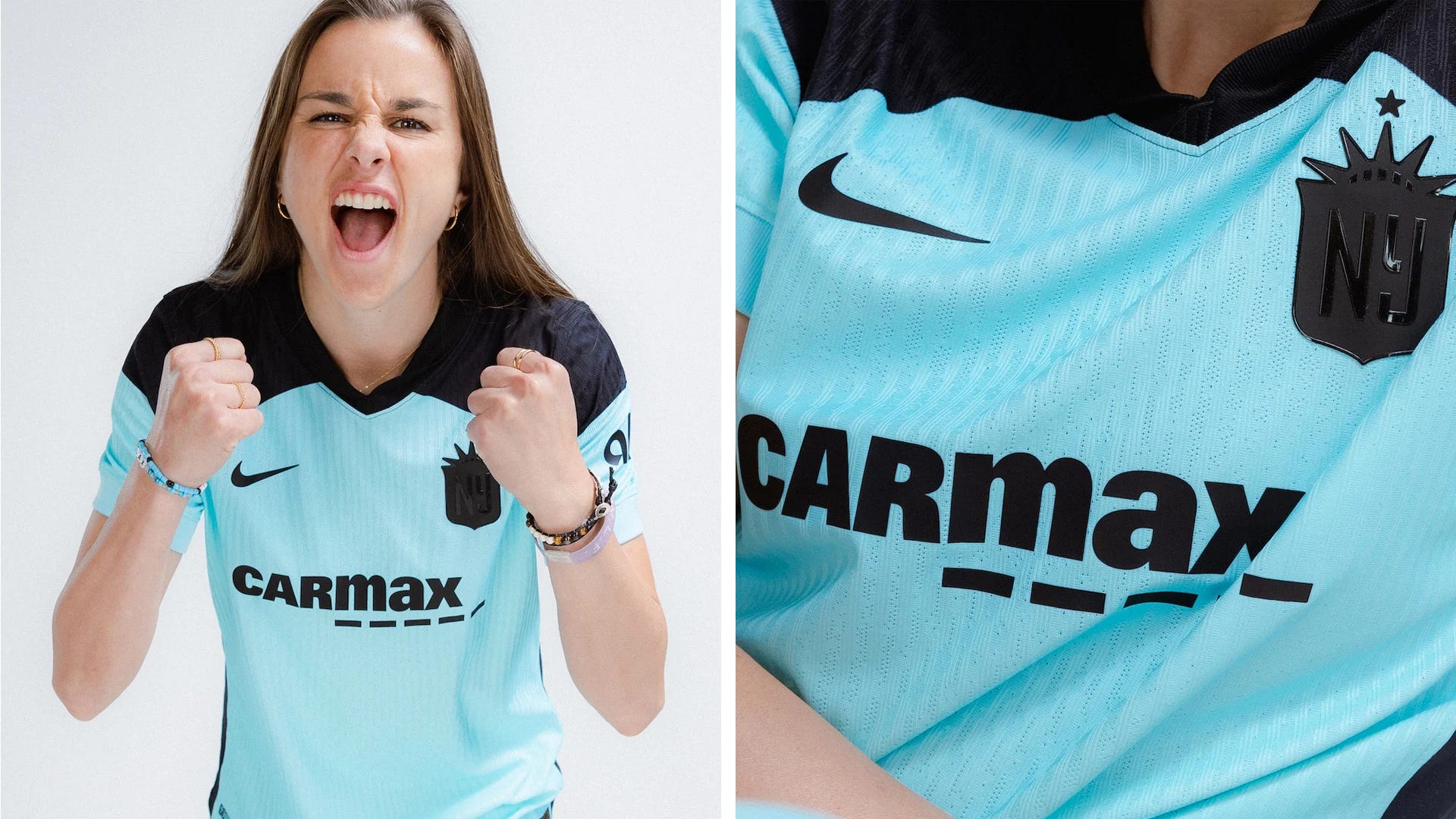
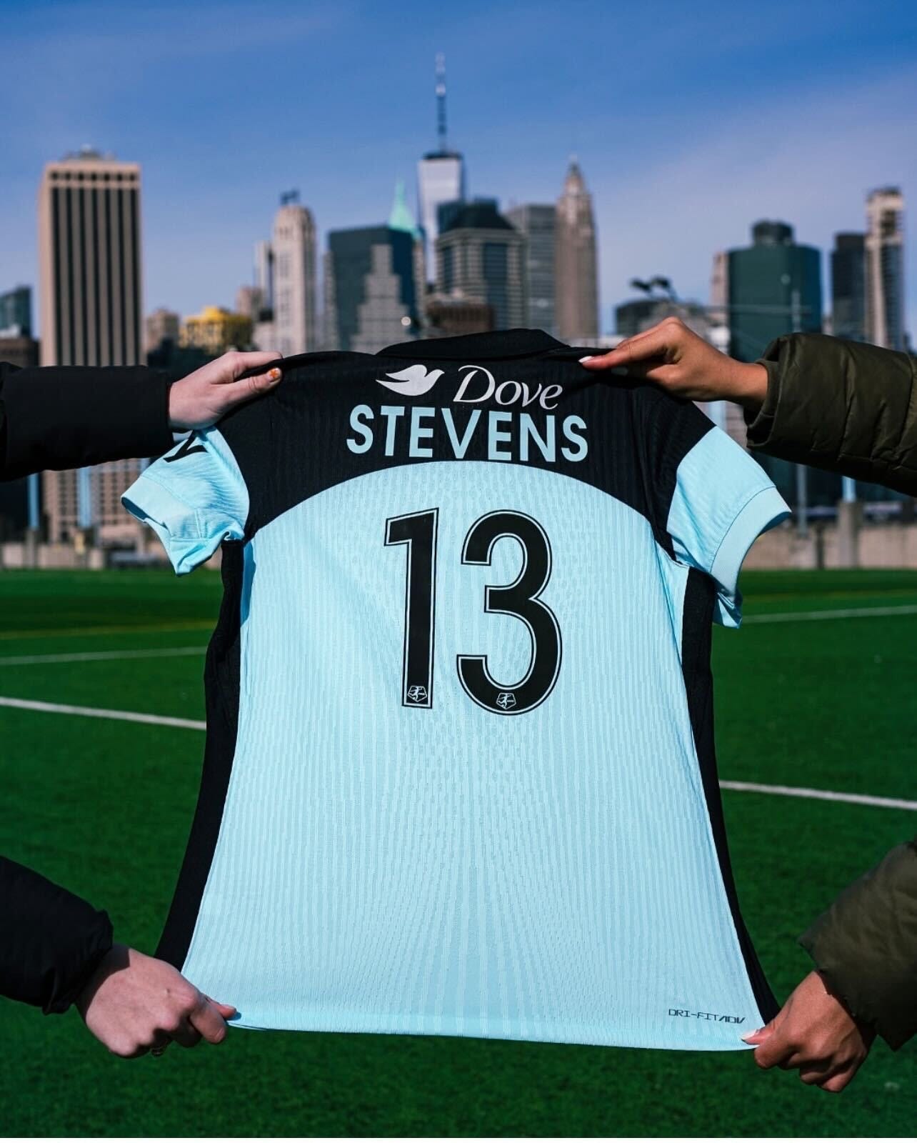
What they say:
The 2025 secondary kit’s colorway “reflects Gotham FC’s grit, resilience, and ambition. The design is rooted in the club’s core values: a winning mentality, welcoming community, high standards of excellence and the desire to transcend beyond the field. Drawing inspiration from Gotham FC’s New Jersey/New York home, the kit design embraces the pride and individuality that define the region.”
What we say:
Both Bekki and Michael initially ranked this kit on the low end due to blandness and the unwieldy shoulder pattern. Once we saw the horrifically bad spacing of the nameplate on the back, however, it dropped to the absolute bottom for both.
Michael: “It looks like a practice jersey. I don’t like that you can’t read the badge.”
Bekki: “I like the blue color, but the all-black crest is a head scratcher. I don’t like the choice of all blue shorts either. The spacing on the nameplate on the back is an absolute crime against football.”
Chicago Stars FC
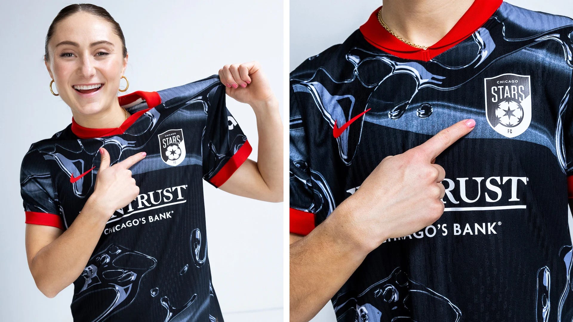
What they say:
"The secondary kit represents a “menacing alter ego to impose on Chicago's opponents anywhere the team goes. The sleek, dark design with liquid metal-like patterns symbolizes the relentless intensity that lies within and the team’s ability to adapt to any challenge.” This kit also features the new Chicago Stars crest for the first time.
What we say:
We’re not a fan of this pattern and the black and white badge choice robs the kit of a splash of needed color.
Michael: “It’s fine. I don’t like this pattern as much as some of the previous ones they have done.”
Bekki: “I don’t think it’s fine. The jersey by itself is okay, but the matching pants make it look like a set of kids’ pajamas.”
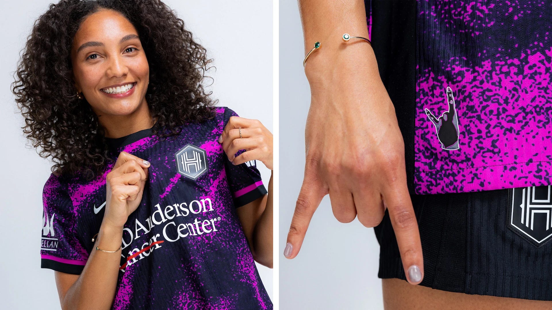
North Carolina Courage
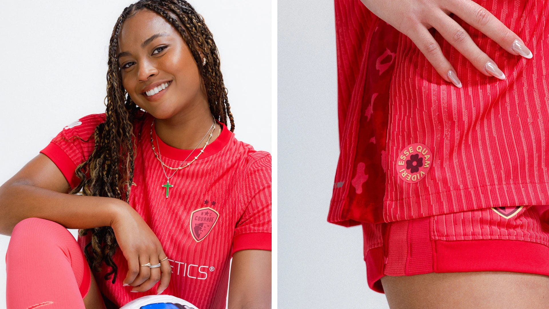
What they say:
“The Courage's secondary kit embodies North Carolina as 'The Place to Be'. The 2025 secondary kit is more than just a jersey—it’s a battle cry. In a lion pride, the lionesses are the true hunters, the fierce protectors, and the heart of the pride. They embody strength, resilience, and unity. Their ability to work together allows them to overcome even the fastest and strongest opponents, making them the ultimate symbol of female power and the divine sisterhood—women lifting women, believing in each other, unstoppable together. The pattern features subtle rosettes, the unique markings found on lionesses—symbols of both power and grace. Named for their resemblance to roses, these rosettes also represent courage and purity, values deeply woven into the fabric of North Carolina.”
What we say:
This was more of a ‘meh’ than a true loser, but both ranked it below the halfway point.
Michael: “I really like the red. The stars pop. Don’t love the look of the badge.”
Bekki: “I also like the color and think it’s a step up from the previous pinkish hue, but it’s too monochromatic. Barely any variation in color from the shorts to the bands to the badge. It’s just too plain.”
Winners
Not all of these garnered a passionate response from your hosts, but Michael and Bekki at least agreed on the positives more than the negatives for each.
Utah Royals
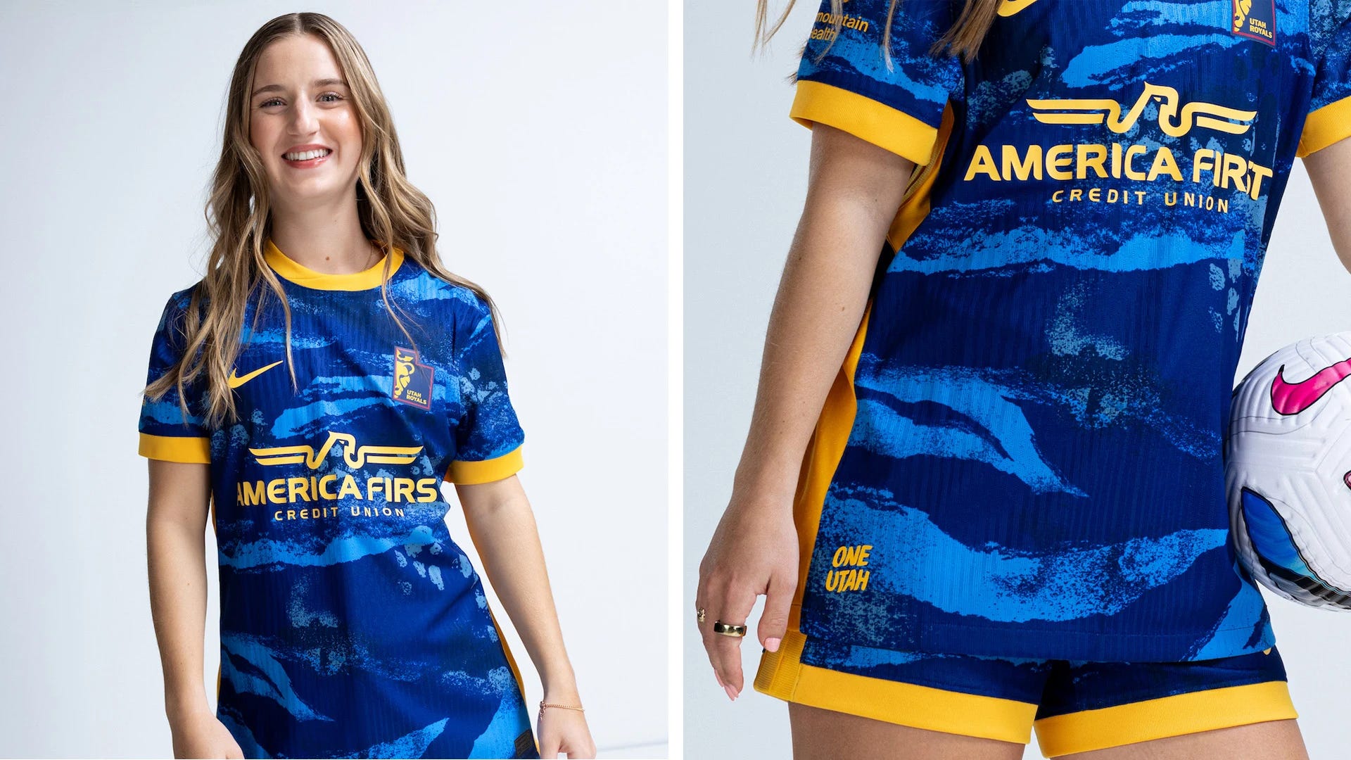
What they say:
The new kit is designed after the Great Salt Lake. The pattern embodies the color and terrain of Utah. The crest is Utah’s secondary mark in the shape of the state of Utah.
What we say:
Both Bekki and Michael loved the color combinations and the contrast between the gold banding and dominant blue shades.
Michael: “Absolutely love this shade of gold and the thicker bands on the collar and the sleeves.”
Bekki: “Agreed about how a small detail like the thickness of the bands makes all the difference. The contrasting blue and gold complement each other as well — or better — than any others this season.”
Orlando Pride
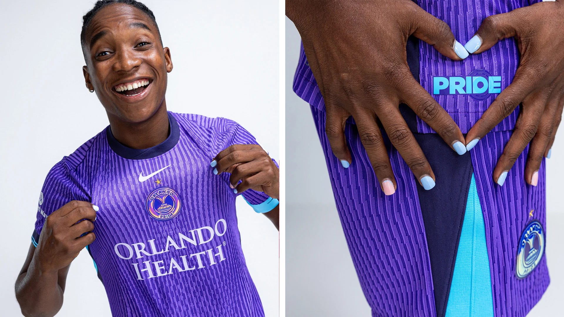
What they say:
The Decennial kit is inspired by Orlando Pride’s original 2016 jersey, sporting Orlando’s base purple and Eola Blue accents on the sleeves. The kit features a stacked iridescent crest as a nod to the two pieces of hardware won by the Pride in 2024 (NWSL Shield and NWSL Championship) and the design pulls in elements from some of Orlando’s past kits over the last 10 years.
What we say:
Michael is a bit more of a fan, but both appreciate the hat tip to past Pride jerseys.
Michael: “This is a great reboot. The iconic purple! I really like a central crest and the colors on it are nice.”
Bekki: “I also love the classic color and the colorized crest but don’t love the matching shorts. The light blue works great on the arms, but I wish it was on the neckline, too. I actually really dislike centralized crests as a rule, but I think it works well here.”
Racing Louisville FC

What they say:
The pattern on the side features the Lily, deriving from the fleur-de-lis in the crest. “Dark tones of monochromatic greens symbolize harmony. Accents and hints of mint green are a nod to Louisville’s entertainment factor. Like the city of Louisville’s tree canopy — which is made up of tulip poplar, sycamore and American beech trees — the strength of Racing Louisville’s foundation is in its many pieces that come together each game day.”
What we say:
The color is great, so are the crest and the side detailing. It’s not our favorite, but it ranked in the top quarter for both Bekki and Michael.
Michael: “The green is unique and the logo on the shorts looks especially good.”
Bekki: “I’ve wanted a true green kit in this league for some time and this is a perfect color. It’s a bit plain in design, but the color choice saves it — especially with the nicely contrasting shorts that emphasize the green logo.”
Angel City FC
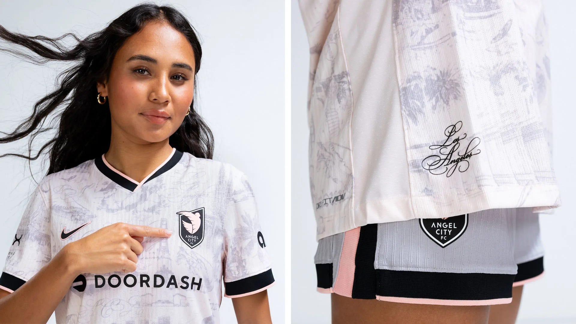
What they say:
Angel City's new secondary jersey is the club's “love letter to Los Angeles” thanks to the all-over toile pattern featuring beloved LA landmarks and symbols. The color blocking on the sleeves and neckline of ACFC’s signature colors, Sol Rosa and
Asphalt gives the jersey a vintage look.
What we say:
The idea is really nice and so is the pattern, up-close. But we fear that it will disappear from a distance.
Michael: “I really like the sublimated pattern, although they tend to not show up on TV wide shots. Wish the script ‘Los Angeles’ was larger.”
Bekki: “I love the pattern. Even if it doesn’t show up at a distance, it’s a really nice piece for fans to own and the thick pink and black bands on the sleeves, collar, and shorts will keep it from being too wiped out on broadcast.”
Divisive
Houston Dash
What they say:
The Dash have added purple in their secondary kit, titled Cosmic Storm, for the first time ever. “The Dash is embarking on a new chapter – and the kit represents organizing the chaotic energy to create a cosmic storm and a new beacon of hope for the club. Aiming to “Go Beyond” where they have been, to emerge from the cosmic storm to create a new star(s) in Houston.”
What we say:
Michael ranked this near the bottom while Bekki put it in her top six.
Michael: “If not for the badge, I wouldn’t know this was the Dash. I would have guessed Orlando.”
Bekki: “The abandonment of their traditional colorway doesn’t bother me at all. I love the pattern, I like the chosen purple color. I like the fact they went bold and in a new direction. There’s only so much you can do with orange, black, and light blue, so saying ‘screw it’ and going in a totally new direction is nice.”
Kansas City Current
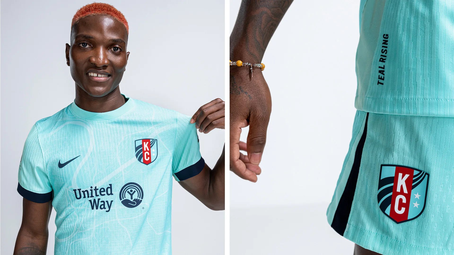
What they say:
The Current's new secondary is their first-ever full kit in their signature teal color. The Teal Town Kit features a map view of Kansas City and the Missouri River with the crest resting over the location of CPKC stadium.
What we say:
Michael was way more taken with the simplicity of this kit than Bekki.
Michael: “Simple, but effective. Really like the detail of having the crest over the location of the city on the map.”
Bekki: “I want to like this so much more than I do. I love the teal and I love the idea of the pattern, but it’s just too subtle. If we were worried about Angel City’s pattern showing up, there’s zero chance this one will. This one was close to tipping into being a winner for me, but I feel a bit too ‘meh’ about it.”
Portland Thorns FC
What they say:
“The new kit is a celebration of the heart and soul of Portland. The dark shades of black symbolize the strength and unity within the city, while the glowing reds represent the embers burning at the heart of the team and supporters. Just like a small spark can grow into an unstoppable fire, the Thorns are powered by the passion of players and fans alike.
This jersey is a tribute to the internal fire that connects all. It’s a reminder that success, both on the field and in the community, comes from a shared purpose and a powerful, unified effort. The Thorns are more than a team—they’re a family, and this jersey represents the strength that comes from being united by a common goal.”
What we say:
This was a top three choice from Michael, but didn’t crack the top seven for Bekki.
Michael: “Simple and iconic. The red crest looks phenomenal.”
Bekki: “I don’t hate it, but I don’t love it. Agreed the crest looks great, but the pattern looks a bit too much like static for me. It’s fine, but I’m just not excited by it.”
Seattle Reign FC

What they say:
The lines streaming across the jersey are inspired by designs across the Seattle skyline, “capturing the strength and beauty of looking and reaching upwards. They're a reminder to hold heads high and create a future that lifts both the club and the community.
“‘Rise’ reflects Reign FC’s pursuit of excellence and relentless ambition to compete for trophies while impacting the community. From the players who step onto the pitch, to the supporters who stand behind them, the Rise Kit is a call to elevate, to aspire, and to push forward together.”
What we say:
This time it’s Michael finding the pattern too bland while Bekki rates it highly.
Michael: “It’s almost too simple. The collar and shorts are the strength of this one.”
Bekki: “I don’t see how you can rate Portland as good simplicity and then find this too plain. I love the radiating gold pattern and the shade of blue for the shorts. The crest looks lovely against the white and gold.”
Bay FC
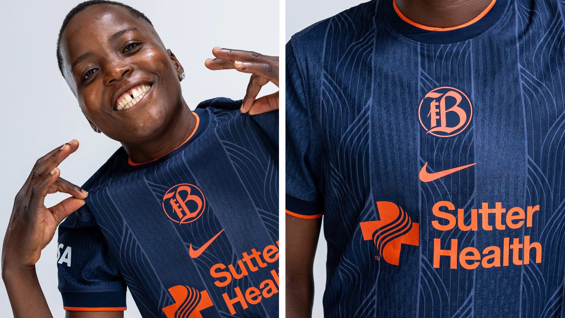
What they say:
This blue kit will take over as Bay’s new primary jersey. The nine lines on the kit represent the nine counties that bind the Bay Area. These lines flow together, symbolizing the power that comes from embracing the diverse identities and backgrounds of the area. Bay has retired their inaugural 2024 kit in the place of a secondary kit in off white with the same pattern in a light bluish grey.
What we say:
Michael was more dismissive and placed it in the lower half of his rankings while it was top four for Bekki.
Michael: “Love a blue and orange combo. the pattern looks good and will be easy to see from far away.”
Bekki: “I ranked this way higher than Michael’s eighth-place. I adore the color combination and feel like the texture of this pattern is more likely to be visible from a distance than some other kits. I only wish the bands were all orange instead of mostly dark blue. Again, I think the stacked center crest works here and I adore the subtle pattern.”
San Diego Wave FC
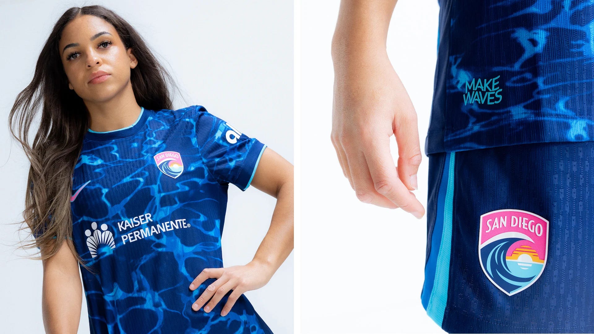
What they say:
“Underneath every Wave, an unstoppable energy runs deep. This club is a force of nature, rising together from the ocean’s depths to lift San Diego to untold heights.” The Altamar kit features a combination of deep ocean blues and tide-like teals. While their 2024 kit symbolizes the sun, this one represents the sea.
What we say:
This kit didn’t make a splash for Michael who ranked it in his bottom four. Bekki, however, found it significantly more pleasing.
Michael: “The water pattern fits with the Wave but I don’t love this shade of blue.”
Bekki: “I have no problem with the colors and like that the pattern is as visible and well-rendered as it is. There’s no question it’s light reflecting on water. I also appreciate that, when coupled with their primary, both kits represent the key aspects of their crest: The sun setting over the water.”
Washington Spirit
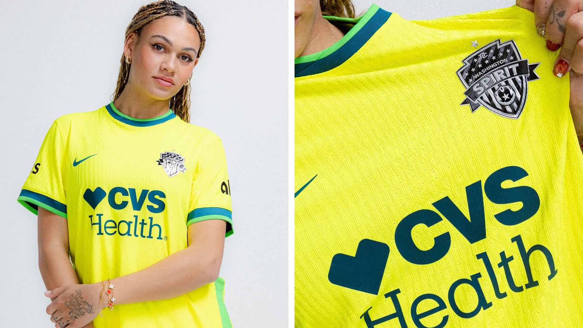
What they say:
The ‘Shockwave’ kit is “built for those who shake foundations, shatter expectations, and ignite a passion in the District. Inspired by the electrifying support of the club’s fans, the Shockwave kit’s bright colors are emblematic of the amplified energy we harness from the roar of the crowd. This bold yellow kit isn’t just seen; it’s felt. It pulses with the rhythm of the club’s play on the pitch, amplifies the power of the supporters' cheers, and turns every match into a seismic event.”
What we say:
In one of our biggest disagreements, this was top five for Michael but bottom three for Bekki.
Michael: “The yellow grew on me last year and this looks like a darker shade, which I like.”
Bekki: “I actually don’t mind the yellow even if I would like it more if it had shorts of a different shade. I just don’t think it does anything new. The green highlights makes it look like Australia and I still feel like we’re treading water waiting for that rebrand that was promised two years ago.”
Bekki needs to open her eyes and have another GOOD look. Her eyes are wide shut!